


Did you sob during the first 10 minutes of Up when the old man loses his wife? I certainly shed many tears. It's one example of loneliness in older adulthood, an often neglected factor in our quality of life.
Here's how I designed an events-finding mobile app and tackled unique accessibility issues for an often-overlooked population.
For this project, I focused on older adults between 50-64 years old. This population has higher smartphone use compared to those above 65.
Events are opportunities for us to socialize with others. We tend to connect through shared interests and hobbies. However, when I spoke to a few older adults who have tried using events as a way to meet people and mitigate loneliness, two barriers came to light:
“I joined a few clubs based on my interests, but it’s difficult to connect with others when I’m usually much older than other participants.”
Problem 1: Older adults can feel out of place when events are not catered for their age group.
“If you are physically immobile, it's frustrating to have to figure out whether you can access an event or not."
Problem 2: Older adults' accessibility needs are often not met nor displayed in an efficient manner.
So, how can we help older adults who are experiencing loneliness attend events? I analyzed a few popular event-finding apps to see what's missing.
Goal: To identify accessibility and usability gaps that could make socializing more inclusive for older adults.


When browsing events on existing solutions, it's difficult for users to determine whether their accessibility needs will be met by a specific event. This can isolate older adults, who often have a wider range of mobility, sensory, and comfort needs.
Based on my insights from speaking to older adults + what's missing in the current market, I brainstormed key features for my solution.
1. Accessibility checklist
To target the issue of older adults not knowing whether events meet their needs, event hosts can input accessibility features for their event. For example, accessible parking and step-free entry.

2. User verification
In my interviews, I found that older users tend to have privacy and security related concerns when it comes to new technology. So, I sketched a user verification flow to help users build trust in the solution.

3. Personalization
The older adults I spoke to expressed varying comfort levels with social events, e.g. preferring different group sizes or time of activity. A personalized explore page can help them find events that feel welcoming, making it easier to take that first step toward connection.

4. High WCAG standards (AA or AAA)
To ensure accessibility of the app itself, I will design with a >7:1 contrast ratio for text, clear section headings for hierarchy, and large tap targets for easier navigation.
I went back to the 3 older adults that I interviewed (58-65 years old) and tested my wireframes. I followed Nielsen Norman Group’s guide for testing with older adults. My objectives were:
When analyzing the testing results, I used ChatGPT to help identify themes. I then iterated my designs based on my insights and added new flows. These were my top 3 changes and why I made them:

“Am I supposed to click on the bar on the top?”
What happened?
The user thought the progress bar was interactive. This suggested that while older adults benefit from step-by-step guidance, too many design elements can also be a distractor.
The change
To reduce confusion, I redesigned the progress bar to be more minimal and removed labels, providing visibility of system status without distracting from the onboarding task.

“Why do I need to verify using my ID card? And I didn't expect to be taken out of the app when I pressed the ‘Verify identity’ button.”
What happened?
Users felt uneasy about submitting their ID and was confused about leaving the app for verification, showing a need for trust signals and clearer instructions. This is consistent with older adults requiring more assurance regarding safety and security.
The change
To better set user expectations on the 'Verify identity button', I added a help and documentation screen before launching the third party verification modal. I also moved the social proof to the first screen to encourage users to verify their identity and build trust in the app.


“How does the app know I like Food and Drinks? What other preferences can I add?”
What happened?
When exploring different events, the categories felt impersonal and generic to the user.
The change
I created a personalization flow during the onboarding stage to collect data. With this data, I changed the event category titles to reflect the user's preferences, such as group size and time of activity.
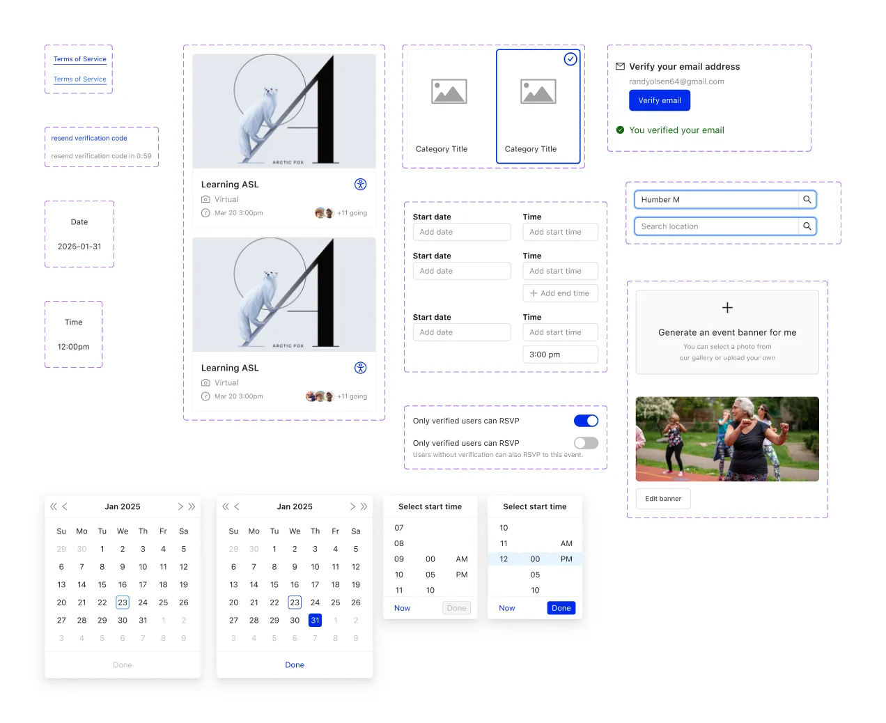
Based on my changes after user testing, I turned my design concepts into a high-fidelity prototype.
At this stage, I felt that some of my components weren’t consistent enough. So, I decided to anchor my component library on Ant Design, an existing design system.
Then, I tested my prototype again with 3 different older adults between 61-63 years old.
This time, my goal was to evaluate new features and assess whether the changes based on the first user testing round solved the previous pain points.
The biggest changes were done to the 'Create an event' page and 'Explore' page:
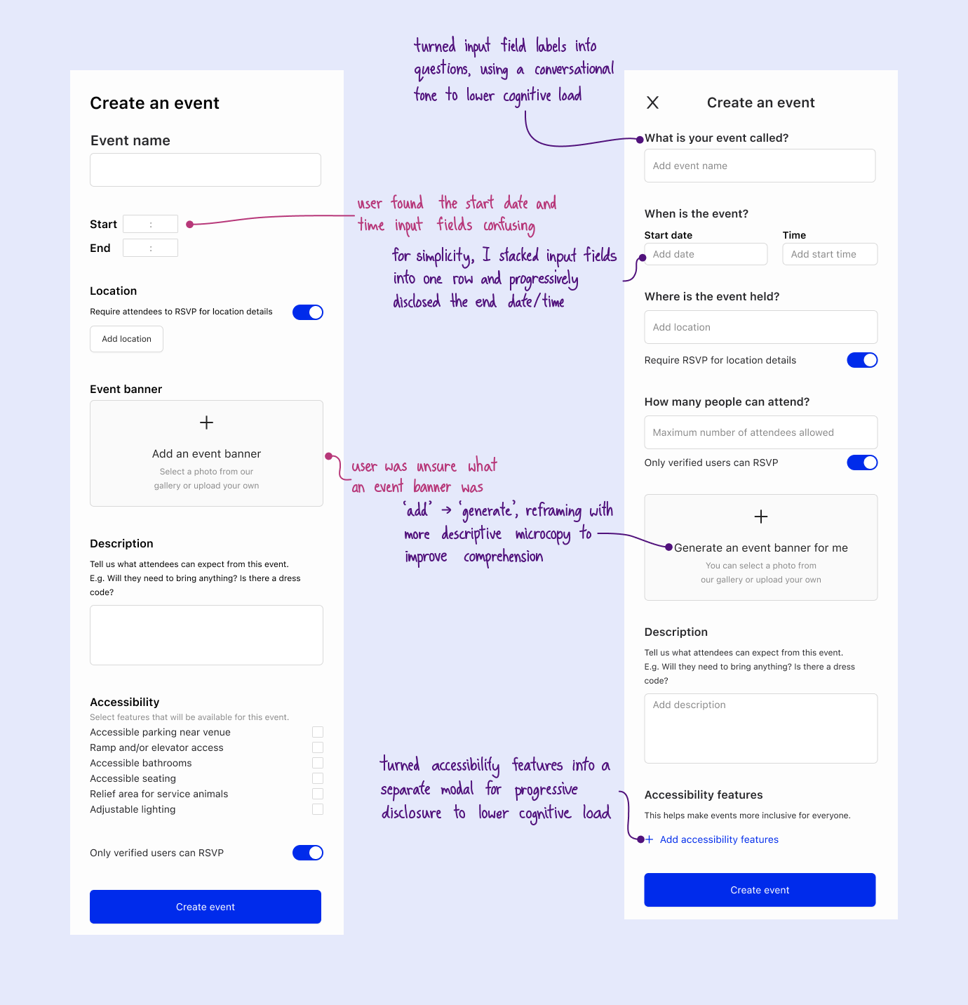
Create an Event: Users commented the screen felt overwhelming at first glance.
I mediated this by 1) incorporating a conversational tone in the labels, and 2) moving the accessibility checklist to a separate modal.

Explore: 'Your top categories' was not a hotspot as I previously thought. Since users are less likely to interact with it, I moved it to a separate page. I also used user data for dynamic category titles.
And finally... *drumroll please*
Imagine you're an older adult experiencing loneliness (bonus points if you're also named Randy Olsen), wanting to connect with others. Lucky for you, here's an app to help you find events via shared interests!
Onboarding is easy to navigate with step-by-step input fields, and a progress bar to provide guidance to older users. There’s also a friendly mascot to build emotional connection.

Older adults may prefer smaller group sizes or earlier event times, so it’s important to recommend events based on preferences that event-finding apps typically don't filter for. By collecting data during the onboarding stage, users can see the value of feed customization and stay engaged.

Older adults are a vulnerable population, so it’s vital to help them feel secure and safe while navigating events with others. I used social proof to encourage users to verify their profiles, and added features that only verified users can interact with for an added layer of security.

Since my user testing indicated that discovery behavior can be overwhelming for older adults, I wanted to make this as intuitive as possible. The headings address specific needs (e.g. “Accessible venues”, “Looking for smaller events?”), and combined horizontal and vertical scrolling for easy browsing.

I opted for an accessibility features checklist to simplify the event creation process. This provides context-aware recommendations to show relevant options based on location type (e.g. park, restaurant, residential) and reduces cognitive load when creating an event.

Ask and iterate!
Older adults have varying levels of tech literacy, so it was crucial for me to understand and accommodate their specific needs. Without user feedback, I wouldn’t have known about how older adults engage in less discovery behavior and require more thorough onboarding.
Using AI
For this project, I fed ChatGPT raw transcripts of user interviews to help me find themes, and used SpecAI to improve my copywriting with consideration of the voice and tone that I wanted. I found that AI was a great tool for improving my design and research workflow.
I would explore creating an event flow for virtual events. For the purposes of this project, I targeted 50-65 years old as the age group with higher smartphone use. If I wanted to expand to a more senior range, virtual events would be one way to include those with more physical limitations.
And that’s a wrap! If you have any questions or feedback, please don't hesitate to contact me.
Or, view another project:
Helping households manage food waste
